The Product
Fresh Bloom’s is owned by a local florist that specializes in flower bouquets. The typical user is between 25-60 years old. Fresh Bloom’s goal is to make shopping fun, fast, and easy for all types of users.
Project Duration: April 2021-July2021
Project Overview
The Challenge
Browsing through online floral bouquets can be time consuming and frustrating for users. Users would also like an in-store pick up option available.
The Goal
Design a floral bouquet website to be user friendly by proving clear navigation, filters for browsing results, and a in-store pick up option.
My Role
UX designer designing a website for a local florist from conception to delivery.
My Responsibilities
Conducting interviews, paper and digital wireframes, low and high-fidelity prototyping, conducting usability studies, accounting for accessibility, and iterating on designs.
Understanding The User
User Research
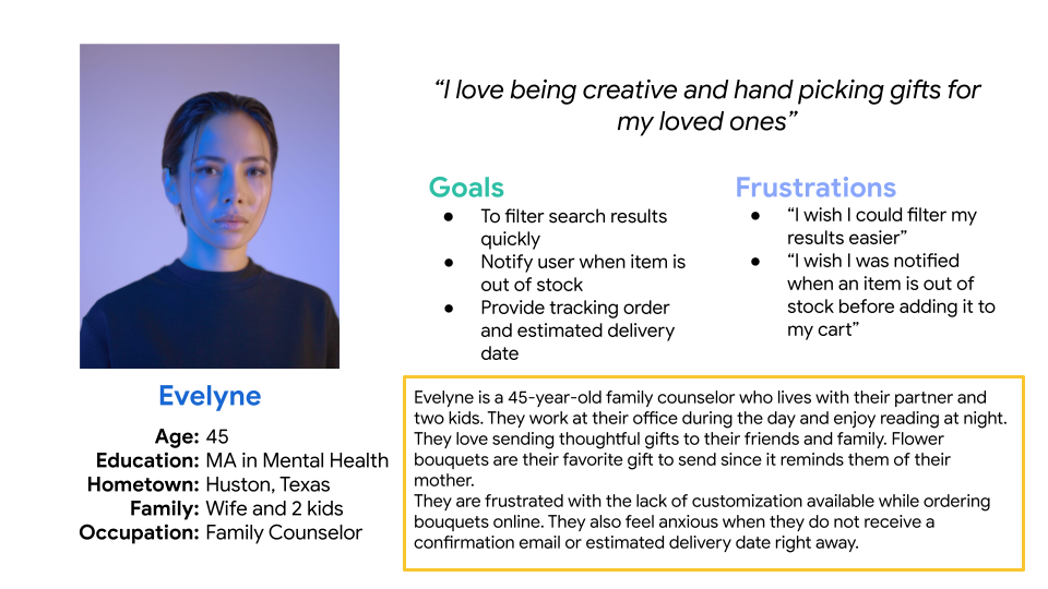
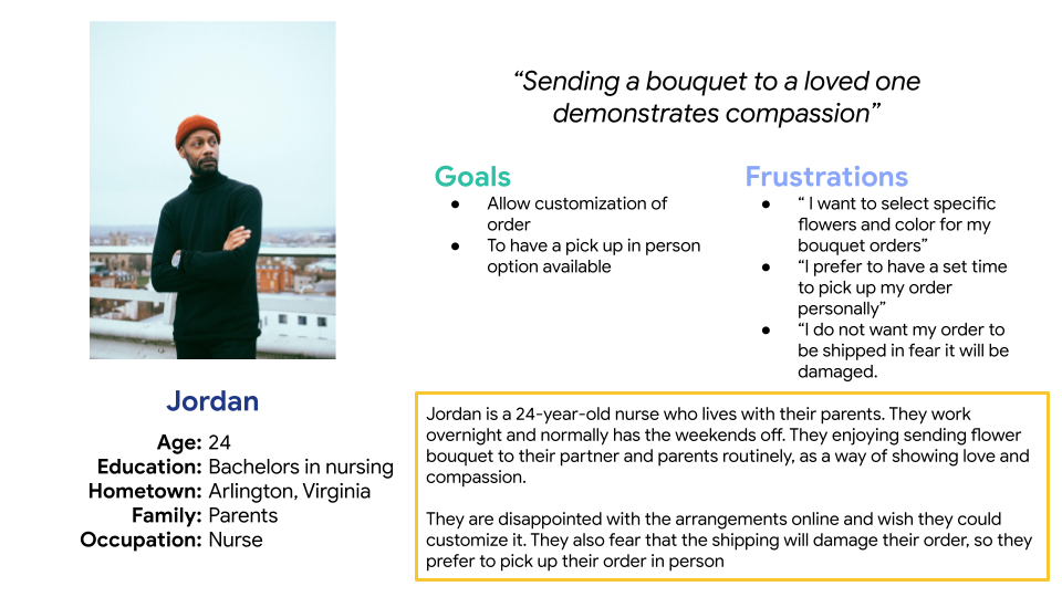
I conducted interviews, which I then turned into empathy maps in order to understand the users I’m designing for and their needs. The research revealed that users felt overwhelmed browsing all the floral bouquets and wanted an in-store pick up option.
User Pain Points
Navigation: Floral website designs are often busy, which results in confusing navigation.
Time: Users need a quick and effective way to browse, select, and purchase floral bouquets.
Delivery: Users want an in-store pick up option, in order to ensure their order is not damaged and arrives on time.
Time: Users need a quick and effective way to browse, select, and purchase floral bouquets.
Delivery: Users want an in-store pick up option, in order to ensure their order is not damaged and arrives on time.
Design Process
Sitemap
Difficulty with website navigation was a primary pain point for users, so I used that knowledge to create a sitemap. My goal here was to make strategic information architecture decisions that would improve overall website navigation. The structure I chose was designed to make things simple and easy.
Paper Wireframes
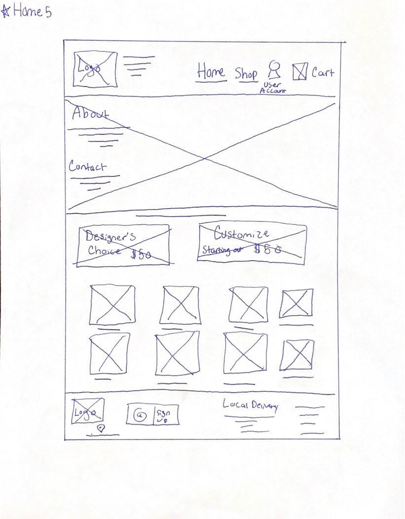
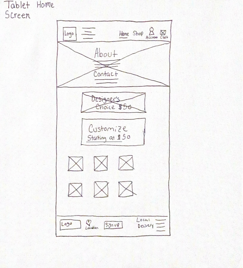
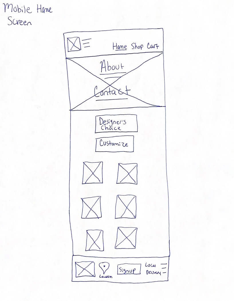
Next, I sketched out paper wireframes for each screen in my website, keeping the user pain points about navigation, browsing, and checkout flow in mind.
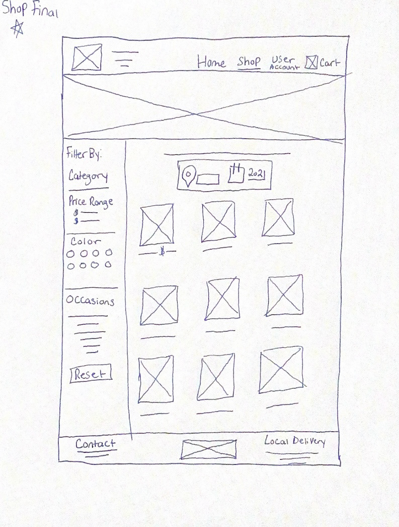
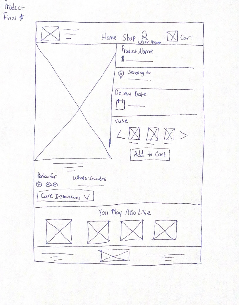
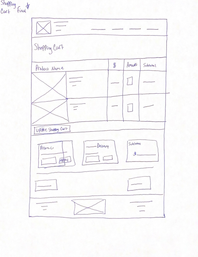
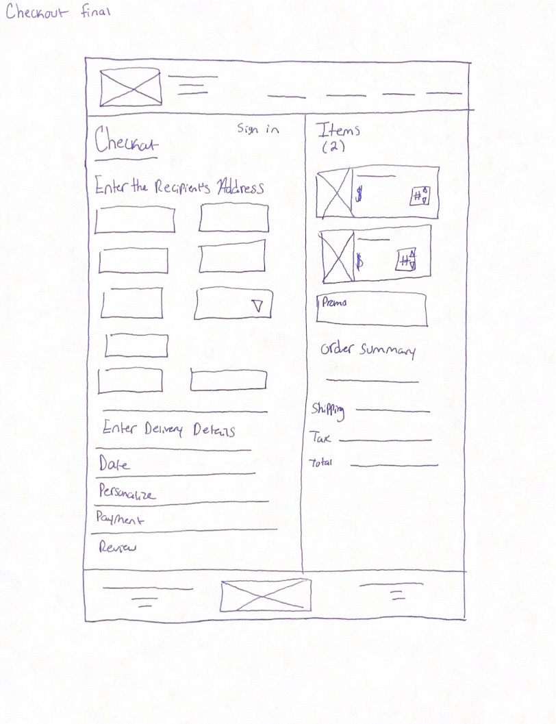
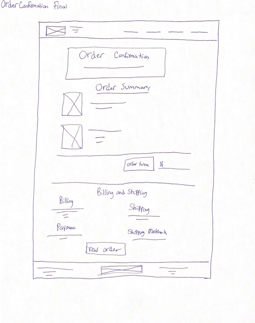
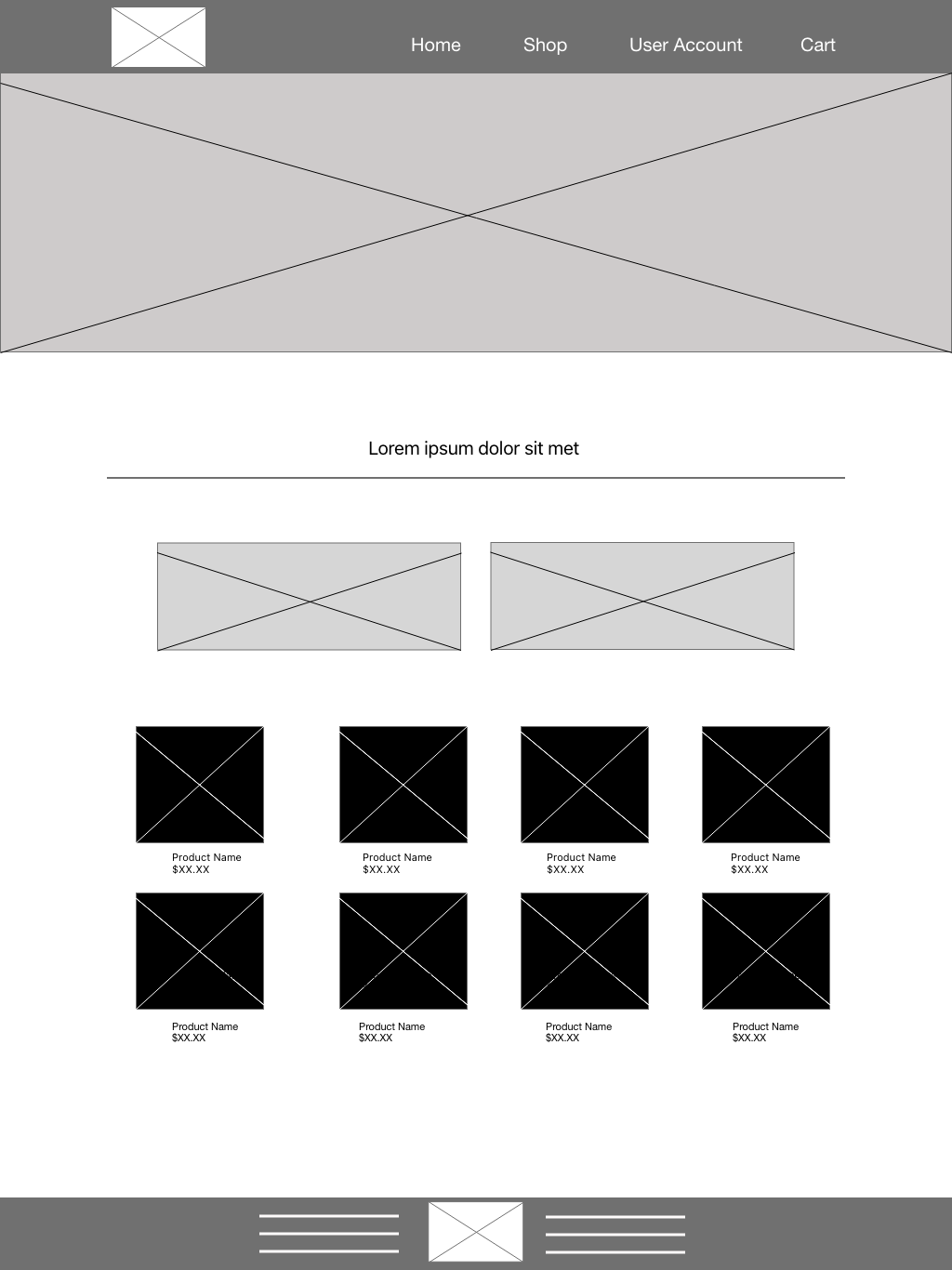
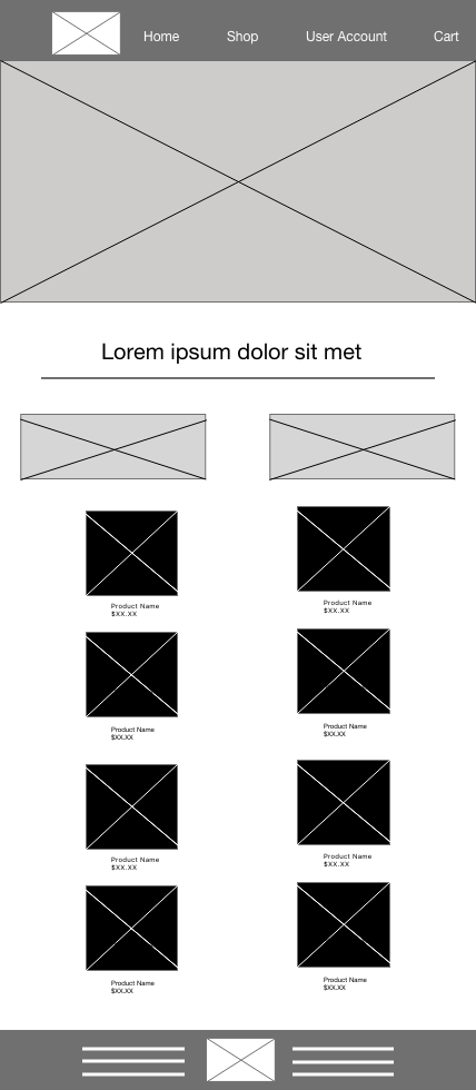
Paper Wireframes Screen Size Variations
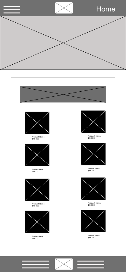
Because Fresh Bloom’s customers access the site on a variety of different devices, I started to work on designs for additional screen sizes to make sure the site would be fully responsive.
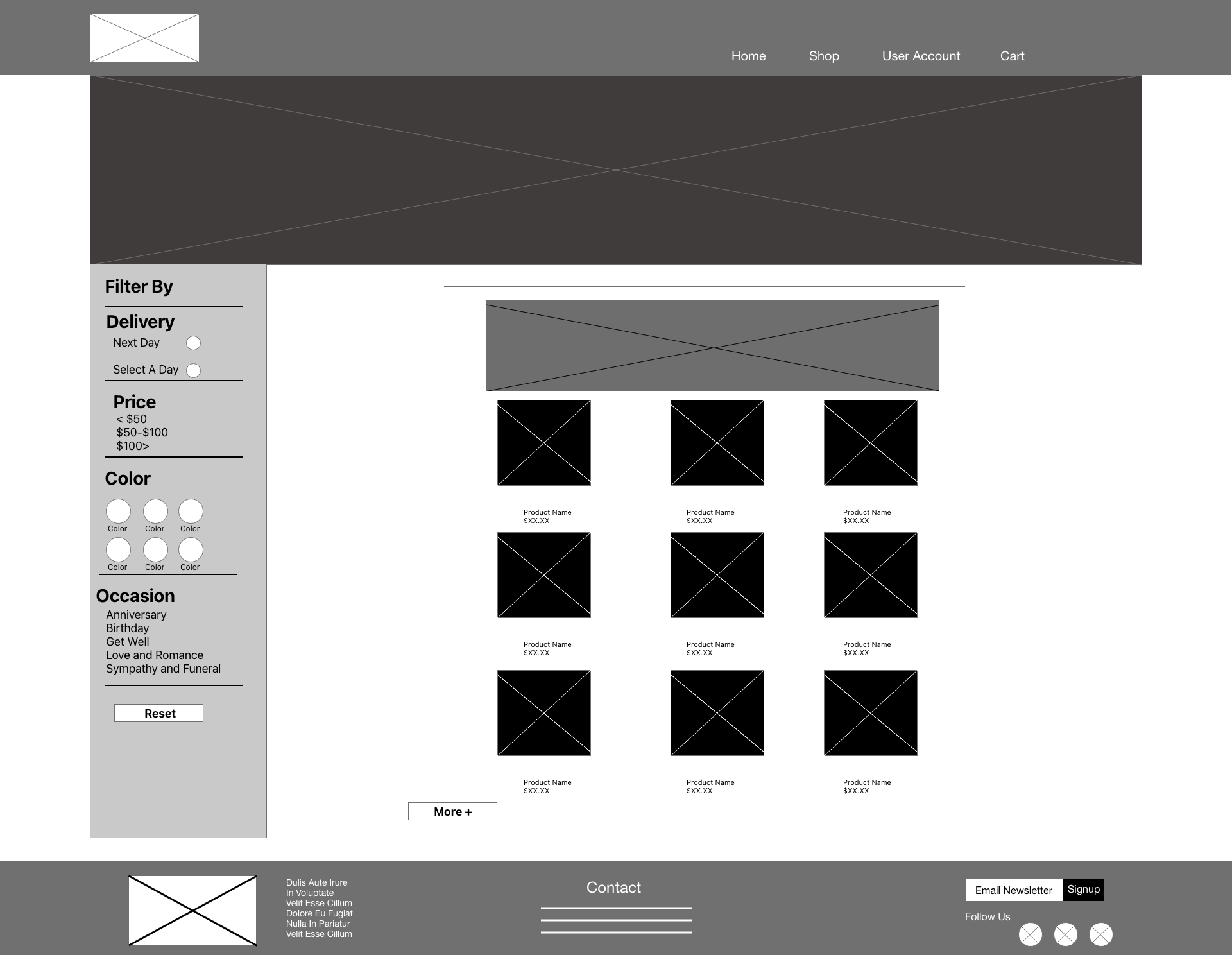
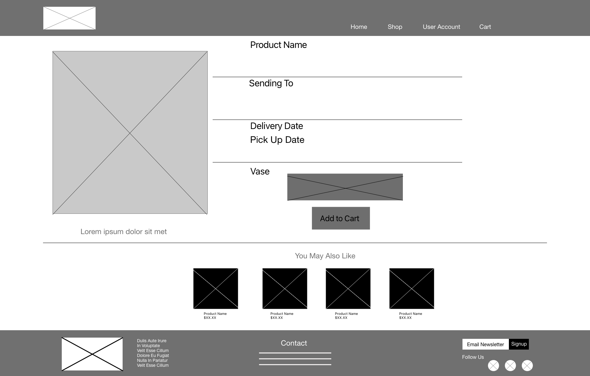
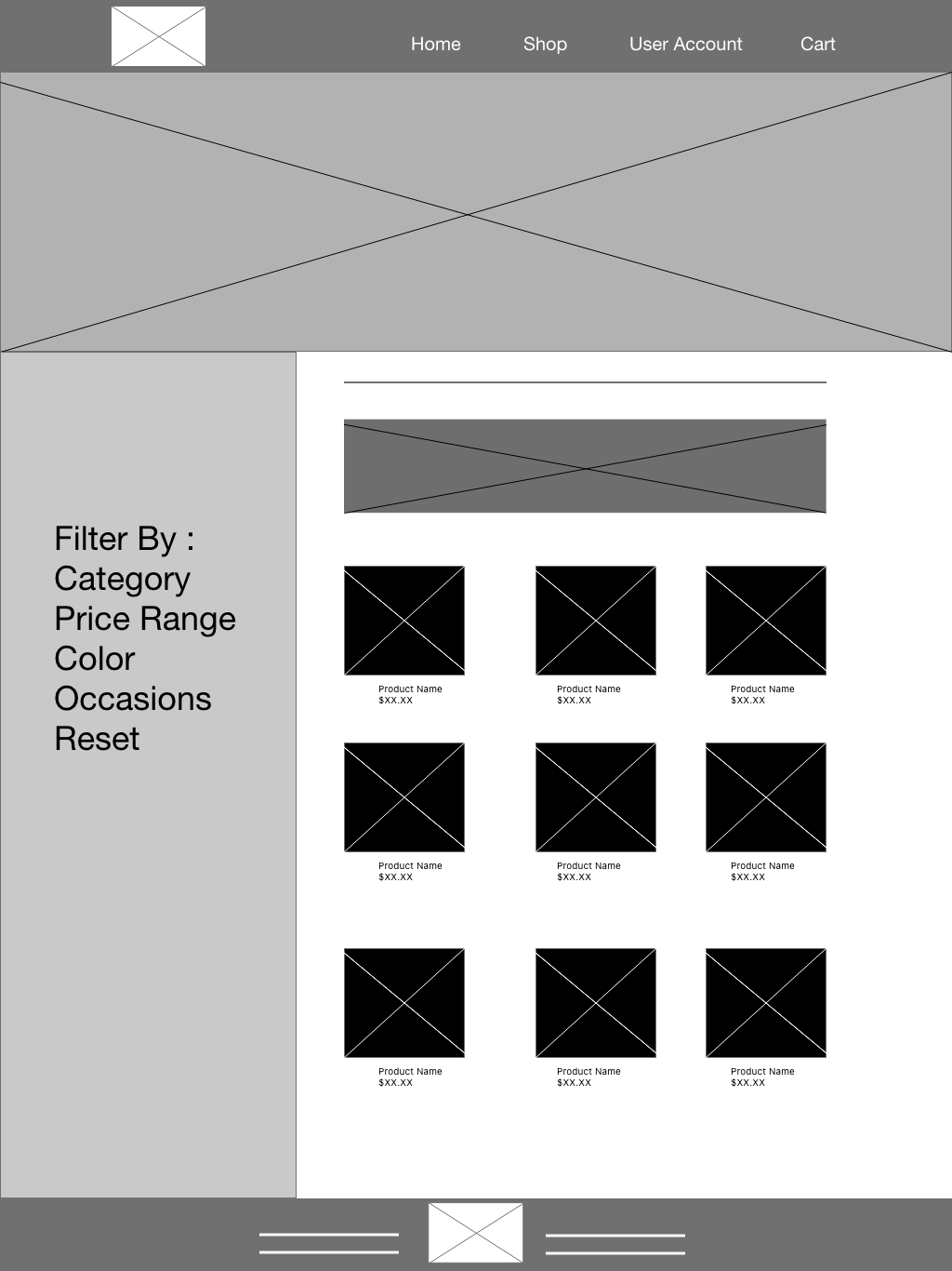
Digital Low-Fi Wireframes
Moving from paper to digital wireframes made it easy to understand how the redesign could help address user pain points and improve the user experience.
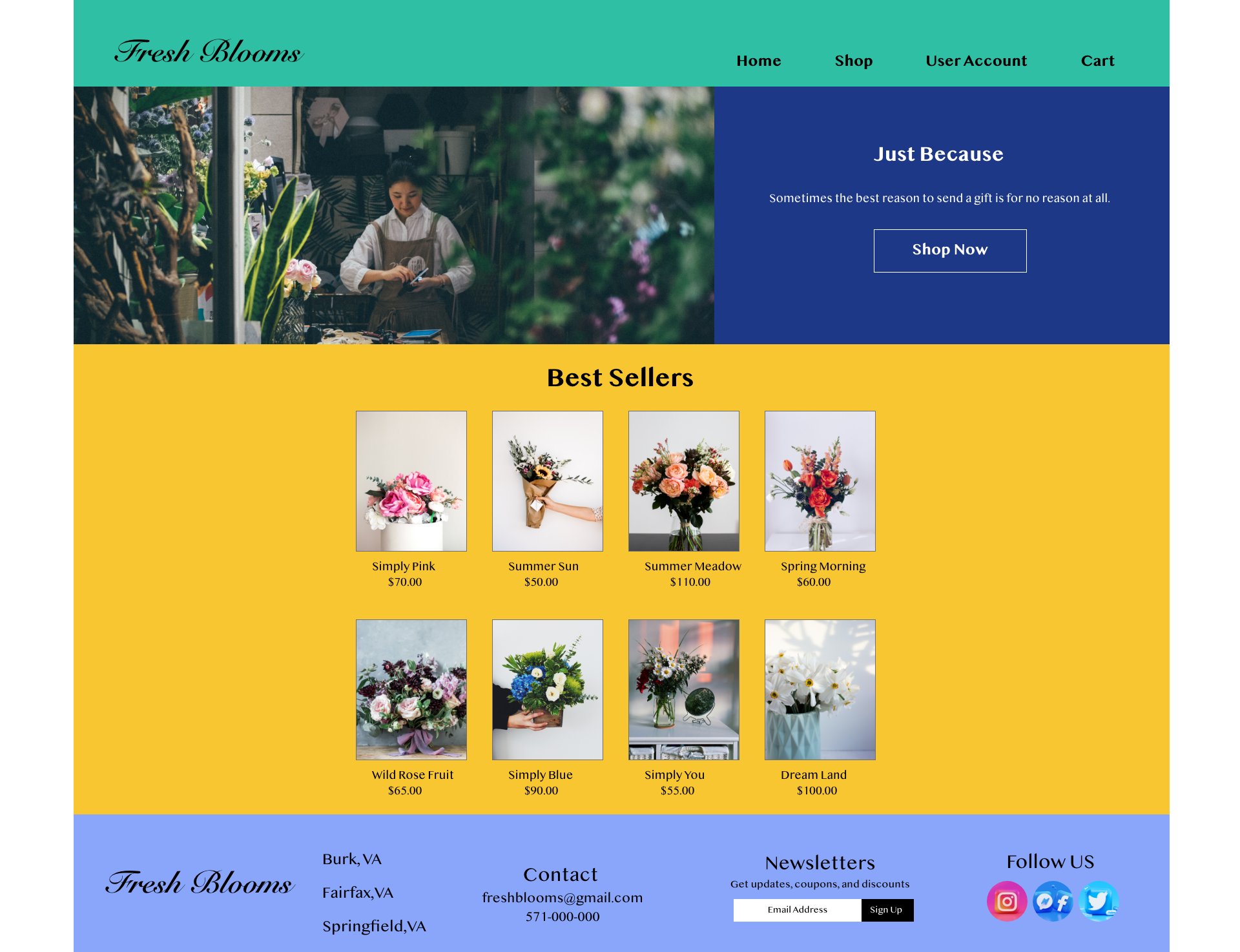
Prioritizing useful button locations and visual element placement on the home page was a key part of my strategy.
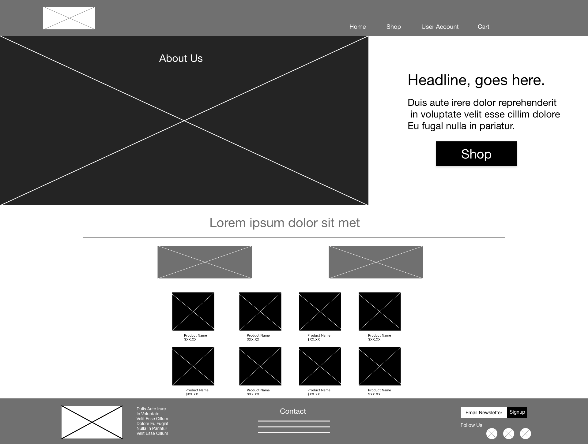
Digital Low-Fi Wireframes Screen Size Variations
Low-Fidelity Prototype
To create a low-fidelity prototype, I connected all of the screens involved in the primary user flow of adding an item to the cart and checking out. At this point, I had received feedback on my designs from usability studies. I made sure to listen to their feedback, and I implemented several suggestions in places that addressed user pain points.
View at
View at
Usability Study Findings
Filters: Based on the theme that: During the shopping process there isn’t a clear way for users to filter the results by occasion or color, an insight is: add an intuitive way to filter shopping results.
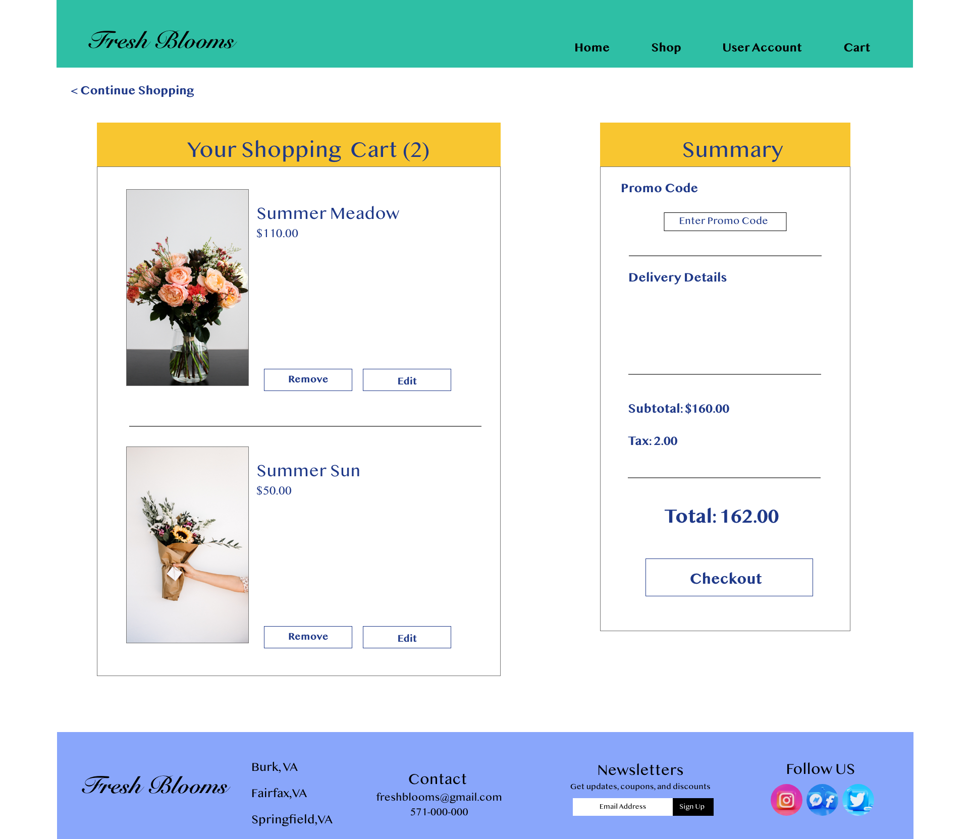
Buttons: Based on the theme that: users do not have a clear way to change or modify items in their carts, an insight is: add “remove” and “edit” buttons to allow for the ability to edit quantity.
Account: Based on the theme that: users can’t easily enter or edit billing and shipping information, an insight is: prompt users to log into their account if they have one.
High Fidelity Mockup
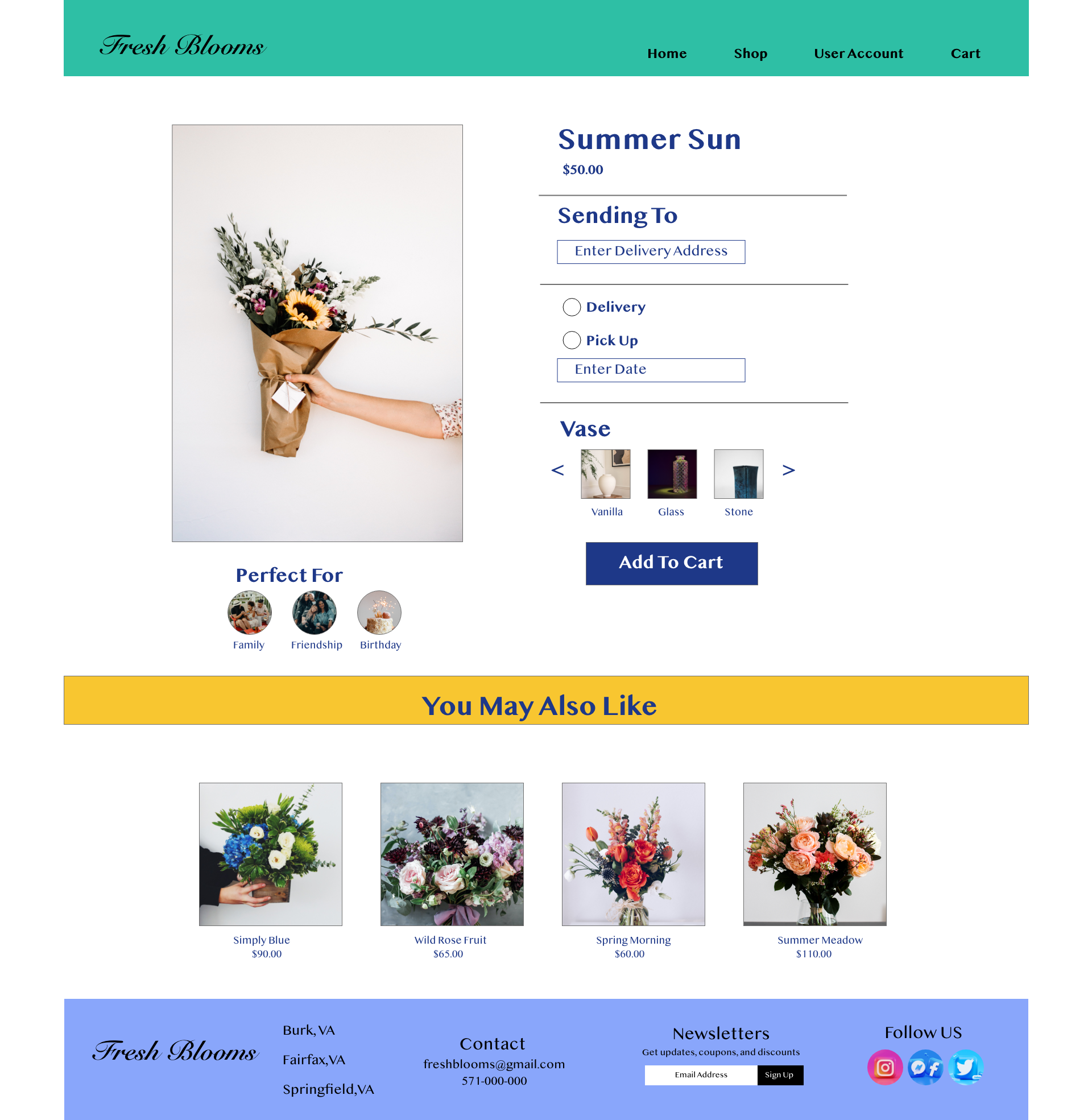
Based on the insights from the usability study, I made changes to improve the search result filters. One of the changes I made was to include a flower type category. This will allow the user to shop by the type of flower they are looking for.
To assist the user in selecting a flower bouquet I added a “perfect for” section in order to pair the bouquet with an event.
To assist the user in selecting a flower bouquet I added a “perfect for” section in order to pair the bouquet with an event.
High Fidelity Prototype
My hi-fi prototype followed the same user flow as the lo-fi prototype, and included the design changes made after the usability study.
View At
View At
Takeaways
Impact
Our target users shared that the design was intuitive to navigate through, more engaging with the images, and demonstrated a clear visual hierarchy.
" I love how colorful the website is. It makes me want to buy flowers."
" I love how colorful the website is. It makes me want to buy flowers."
What I Learned
I learned that even a small design change can have a huge impact on the user experience. The most important takeaway for me is to always focus on the real needs of the user when coming up with design ideas and solutions.
Key Challenges
This was the 1st website I worked on from start to finish. The biggest challenge was making the website visually engaging without overwhelming the user.
Next Steps
- Conduct follow-up usability testing on the new website
- Identify any additional areas of need and ideate on new features
Let's Connect!
Thank you for your time reviewing my work on Fresh Bloom’s floral bouquet website! If you’d like to see more or get in touch, my contact information is provided below.
